Wivai
Navigation
Scope:
3 months. 2022.
Design sprint.
My Rol:
Product Designer, UX UI Designer.
- Tool: Figma.
- Google Form
- Google Analytics
- Hotjar

Overview
This process is supported by a detailed audit of the subcategories, followed by usability testing to ensure continuous improvement of the user experience. The successful implementation of this solution aims to enhance usability and streamline product search, which could have a positive impact on conversions and long-term customer retention.
The problem

Possible problems
and solutions:
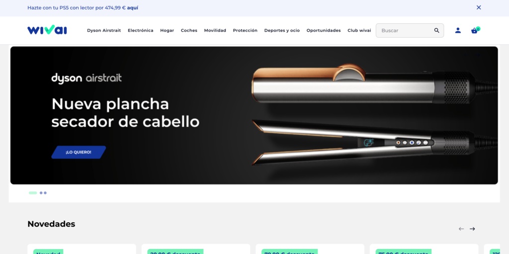
Inconsistency in categorization: The category «Dyson Airstrait, which is a temporary promotion category,» appears to be a specific product, while the other categories are more general. This could confuse users. Consider moving this product to a more relevant category, such as «Electronics» or «Home,» depending on its nature.
Lack of thematic cohesion: Some categories, like «Protection» and «Club Wivai,» do not clearly fit with the main theme of the site, potentially causing confusion.
Unclear organization: The current order of categories does not seem to follow a specific logic, which could hinder user search and navigation.
Confusing nomenclature: Some categories, such as «Opportunities,» may not be descriptive enough and could confuse users about their content. Consider renaming these categories to be clearer and more descriptive.
Solution Approach
As Product Designer, my goal is to optimise the navigation menu of our e-commerce site to improve usability and user experience.
Subcategory Audit
Conduct a thorough audit of existing subcategories in each main category.
Assess the relevance and quantity of products within each subcategory.
Logical Grouping
Group related subcategories under coherent main categories.
Organize these subcategories logically and sequentially for easy navigation.
Prioritization
Establish a clear hierarchy within each main category, placing important and popular subcategories prominently.
Use visual techniques like indentation or icons to represent the hierarchical relationship between categories and subcategories.
Usability Testing
Conduct usability tests with real users to evaluate the effectiveness of the new navigation menu design.
Gather feedback and make adjustments as needed to enhance the user experience.
Evaluate the usability of the new ecommerce navigation menu.
30 users with varying levels of experience in using ecommerce platforms.
Methodology: Moderated usability test with screen recording and narration of the experience.
Find a specific product
Positive & Negative Points
- The product search was somewhat helpful, but some users struggled with category organization.
- 40% of users found it challenging to locate the Dyson product under "Electronics".
Explore different categories
Positive & Negative Points
- The new menu design is somewhat intuitive, but there were some areas of confusion.
- 20% of users encountered difficulties navigating certain categories.
Find the "Opportunities"
Positive & Negative Points
- The section is somewhat visible, although some users had trouble locating it.
- 50% of users did not find it, not expecting it to be in the footer.
Access the "Club Wivai"
Positive & Negative Points
The access process is relatively simple and quick for most users.
- 10% of users experienced minor issues accessing the "Club Wivai".