Scope:
2 Weeks. 2023.
Design sprint.
My Rol:
Product Designer, UX UI Designer.
Overview
The comparator streamlines the decision-making process by offering a concise overview of differences and similarities among items, facilitating the selection of the product that best suits each user’s needs. This tool fosters a deeper understanding of available options, promoting transparency and trust in online purchasing. Furthermore, it contributes to the conversion process by helping users make informed decisions, enhancing their overall shopping experience.
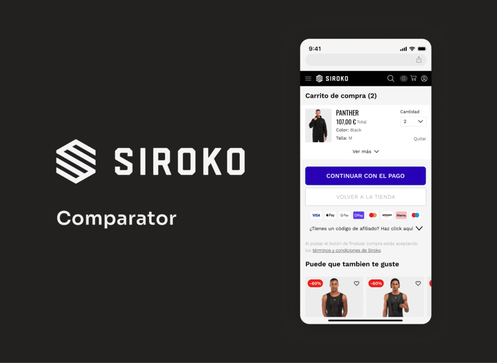
The problem of not having a comparator
Difficulty in decision-making: Users may find it challenging to make informed decisions about which product to buy without the ability to compare features, specifications, and prices in one place. This can lead to indecision and, ultimately, site abandonment.
More clicks and navigation: Without a comparison feature, users may have to make more clicks and navigate through various product pages to gather the information they need. This can be frustrating and result in a less efficient user experience.
Less user control: The absence of a comparison function may limit user control over the purchasing process. Users may feel that they lack a tool to help customize their choices based on their specific preferences and needs.
Increased abandonment risk: When users cannot easily compare products on your site, they are more likely to leave and seek alternatives elsewhere where they can make more effective comparisons.
Lower user retention: A well-designed product comparator can keep users on your site for a longer duration, thereby increasing the likelihood of them making a purchase.
I conducted a brief study on various product comparison platforms, exploring their distinct features and functionalities. The research aimed to understand how these platforms operate, highlighting their tools for users making informed purchasing decisions.


APPLE
PC COMPONENTES
This is a proposal for a minimal comparator within the Product Listing Page (PLP) and with access also from the menu.
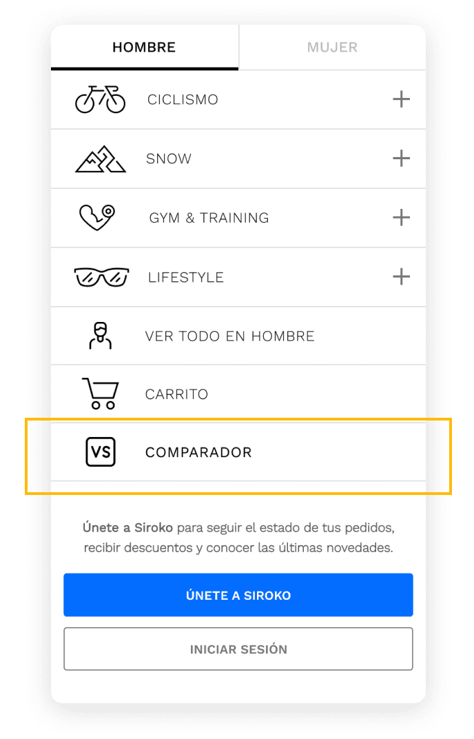
The user could have access to the product comparator from the menu, and it would redirect them to the selection of one of the verticals (jerseys, shorts, etc).
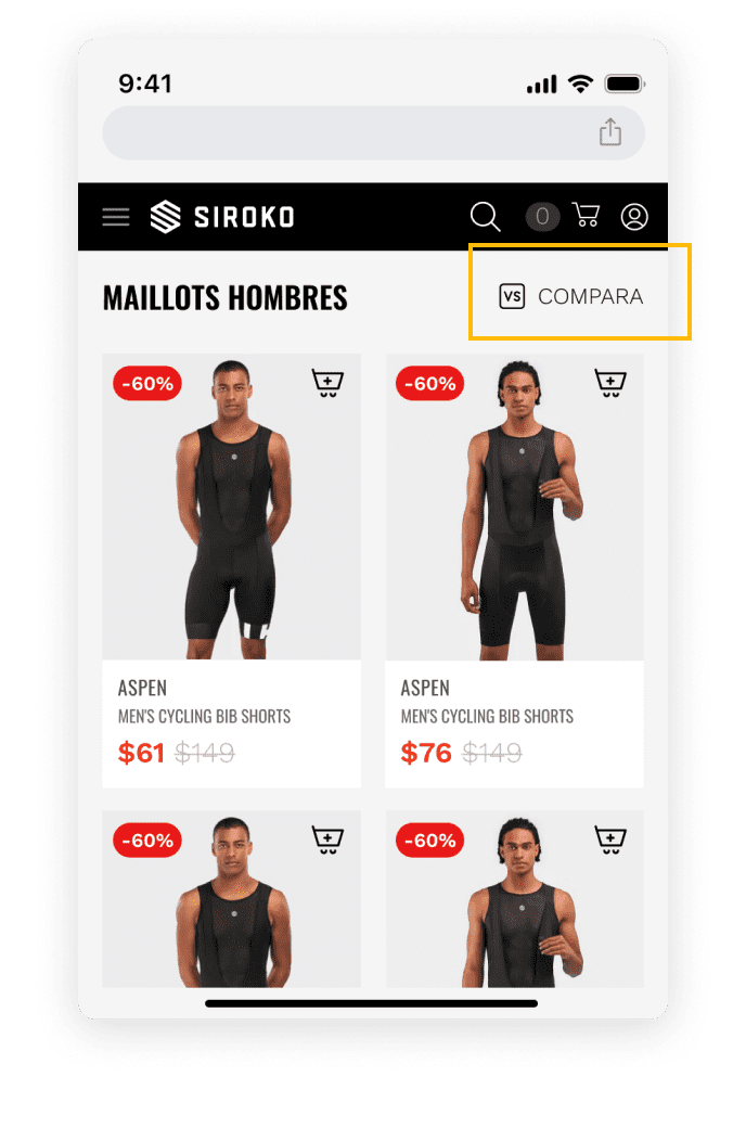
Here, the access to the dynamic comparator would be displayed, allowing the user to select products.
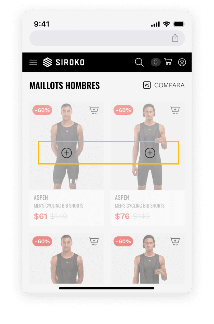
Once the user has accessed the comparator, they will see the selectors where in its mobile version they can choose a maximum of 2 products to compare, and on desktop, up to 3 products.
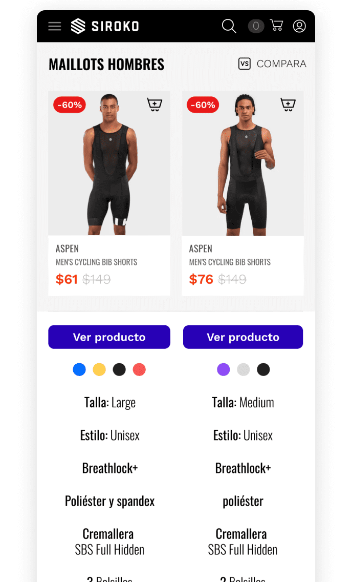
Finally, once the products are selected, the user will be able to compare the differences between each product. It allows viewing each product individually. It allows adding the product to the shopping cart through the icon on the card. It shows other suggested comparisons below the comparison.

A 30% reduction in average task time was observed compared to the previous version of the comparator, indicating an improvement in user efficiency.
We experienced a 20% increase in success rates, suggesting that the new comparator design facilitates decision-making and effective conversion.
There was a 40% increase in usage frequency and a 15% decrease in average interaction duration, indicating more active and efficient adoption by users.
85% of users expressed higher satisfaction compared to the previous version, highlighting the utility and perceived improvement in the overall experience.
Positives:
Areas for Improvement:
Next Steps:
In summary, while the current design shows positive outcomes, addressing accuracy and maintaining a feedback loop are key to ensuring an exceptional user experience and sustained conversion. We remain dedicated to constant evolution for user satisfaction.